

Have you noticed that when you visit some sites on your device – ipad, phone, etc – they seem to fall to the exact size of the screen? There’s also a high chance that you’re reading this post on your mobile phone or handheld device.
As smartphone and tablet adoption rapidly increases, so does the importance of mobile-friendly websites. Mobile sales have already overtaken desktop sales, and mobile Internet usage is predicted to overtake desktop internet usage by 2014. It is only logical that mobile search will overtake desktop search at some point in the near future as well.
In this post, I’ll give 5 reasons why your site needs to be mobile responsive, and soon!
First, What is Responsive Web Design?
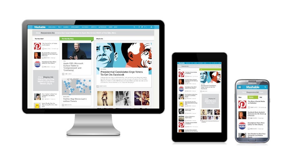
Responsive Web Design is a collection of techniques that allow a website to flex and adapt to the size of screen it’s being viewed on. Someone opening your site on a small smartphone will be shown the same site as the person opening it on their laptop but the site will have noticed the constraints and automatically reformatted to give the user an experience better suited to their device. No more loading a huge website and having to zoom in and out to find the content you’re looking for. Responsive web design takes into account interaction too and makes your site easier to use by acknowledging and integrating things like touch screens to aid navigation.
So, here are the reasons why you may want to tell your web designer to make your site as responsive as ever!
1. MARKET RESEARCH SHOWS MASSIVE MOBILE USAGE GROWTH
current market research shows mobile internet usage is set to grow massively by 2015 with an increase of 16% from 2010. What is perhaps more interesting is that this means the number of mobile internet users will overtake that of desktop users during this time. As of 2014,
- Over 20% of Google searches are performed on a mobile device.
- In 2012, more than half of local searches were performed on a mobile device.
- In the United States, 25% of internet users only access the internet on a mobile device.
- 61% of people have a better opinion of brands when they offer a good mobile experience.
- 25.85% of all emails are opened on mobile phones, and 10.16% are opened on tablets.
“If you’re not providing a mobile-friendly experience for your customers, they’ll bounce off your website and go to your competitor whose website is easier to use. The future is mobile, as we see people increasingly favoring their mobile devices over desktop computers.” – Forbes
2. INCREASE YOUR SEO RATING
A Responsive website will improve your search engine optimization (SEO), making your website easier to find in Google and other search engines.

3. BEST USER ENGAGEMENT & EXPERIENCE
It’s intuitive that if your content is optimized for all devices, your members and potential members will engage more with you online.
Users should have a seamless experience when navigating through the site and you will easily find things whichever device you decide to use. They need to be able to read text, fill out forms, and get to the content they want to see without any frustrations on your site.
If a user has a positive experience on your responsive site, they are more likely to stay, not bounce back to the search results, and convert into a buying customer or lead.
4. WITH SOCIAL MEDIA ON THE RISE, YOUR WEBSITE IS GUARANTEED TO HAVE MORE MOBILE VISITORS
5. FINALLY, FOR PEACE OF MIND!
I just finally changed my website to be mobile responsive, and it was worth it. I’m still tweaking – but it’s good to know that any one who googles Zainab Sule will find me on the first page!