Your website should be your best salesperson. It works 24/7 and reaches customers you’ll never meet in person.
But here’s the problem: most websites aren’t selling—the owners are either bragging about work they’ve done, but never what they do for a service.
Stop Losing Money to a Bad Website
Get a fast, modern, mobile-optimized website that actually converts visitors into customers.
No setup fees. Built for results.
The #1 complaint we hear: ‘My website is not getting sales.’ You’re paying for hosting, maybe running ads, posting on social media to drive traffic… and then your website fumbles the handoff. Visitors bounce. Leads evaporate. Sales go to competitors who simply have better sites.
If any of these signs sound familiar, your website isn’t just underperforming—it’s actively costing you money.
5 Signs Your Website Is Costing You Customers
1. It Loads Slower Than Your Customers’ Patience
The Reality: 53% of mobile users abandon sites that take longer than 5 seconds to load.
Think about your own behavior. When was the last time you sat around waiting for a slow website? You didn’t. You hit the back button and went somewhere else.

Every extra second of load time is a customer walking out the door. If your site takes 5+ seconds to load, you’re hemorrhaging potential sales before anyone even sees your offer. Your competitors with faster sites are taking your customers.
2. It Looks Like It Was Built in 2017 (Because It Was)
The Reality: Your website is often the first impression customers have of your business. An outdated design doesn’t just look bad—it signals that you’re out of touch, possibly out of business, or not serious about your work.
Would you trust a doctor with a waiting room that hasn’t been updated since 2005? Probably not. The same psychology applies online.
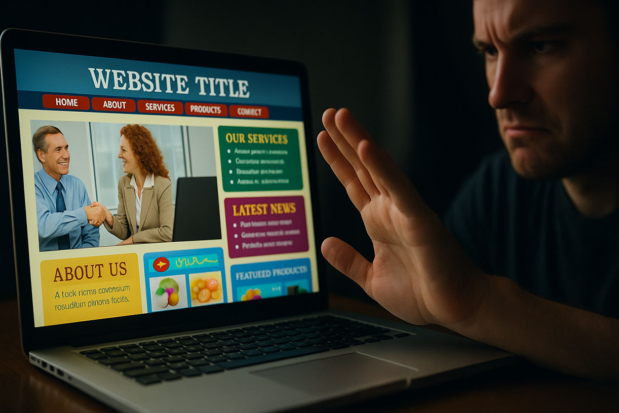
Modern customers expect modern experiences. If your site has:
- – Tiny text that requires zooming
- – Flash animations or auto-playing music
- – A cluttered layout that looks like a digital hoarder lives there
- – Stock photos from the “business people shaking hands” era
You’re telling customers to shop elsewhere and so you lose instant credibility and the assumption that your service/product is equally outdated.
3. It’s a Nightmare on Mobile
The Reality: Over 60% of web traffic now comes from mobile devices. If your site isn’t mobile-optimized, you’re turning away the majority of your potential customers.
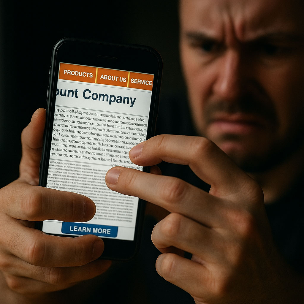
“Mobile-optimized” doesn’t mean “technically viewable on a phone.” It means:
- – Text is readable without zooming
- – Buttons are easily tappable
- – Navigation actually works with thumbs
- – Forms don’t make people want to throw their phone
If visitors have to pinch, zoom, and scroll horizontally just to read your content, they won’t. They’ll leave and buy from someone whose site actually works on the device they’re holding.
4. Your Call-to-Action Is Playing Hide and Seek
The Reality: Confused customers don’t buy. If someone lands on your site and can’t immediately figure out what to do next, they bounce.
Common problems:
- – No clear CTA above the fold
- – Multiple CTAs competing for attention (“Buy now! Sign up! Download! Subscribe! Call us!”)
- – Generic buttons like “Learn More” that don’t inspire action
- – Contact forms buried three clicks deep
Your website should guide visitors on a clear path: land → understand value → take action. If visitors have to hunt for next steps, they simply won’t take them.
The Cost? Traffic that converts at 1% instead of 5-10%. Same visitors, 5-10x fewer sales.
Stop Losing Money to a Bad Website
Get a fast, modern, mobile-optimized website that actually converts visitors into customers.
No setup fees. Built for results.
5. It’s Not Clear What You Actually Do
The Reality: You have about 8 seconds to communicate what you do and why someone should care. If your homepage is filled with vague statements like “We provide innovative solutions for your business needs,” you’ve already lost.
Visitors shouldn’t have to decode your website like it’s a puzzle. Within seconds, they should know:
- – What you sell/offer
- – Who it’s for
- – Why they should choose you
- – What to do next
If your site leads with jargon, abstract concepts, or makes people click three times to understand your basic offering, you’re making it too hard. And when something’s too hard, people give up.
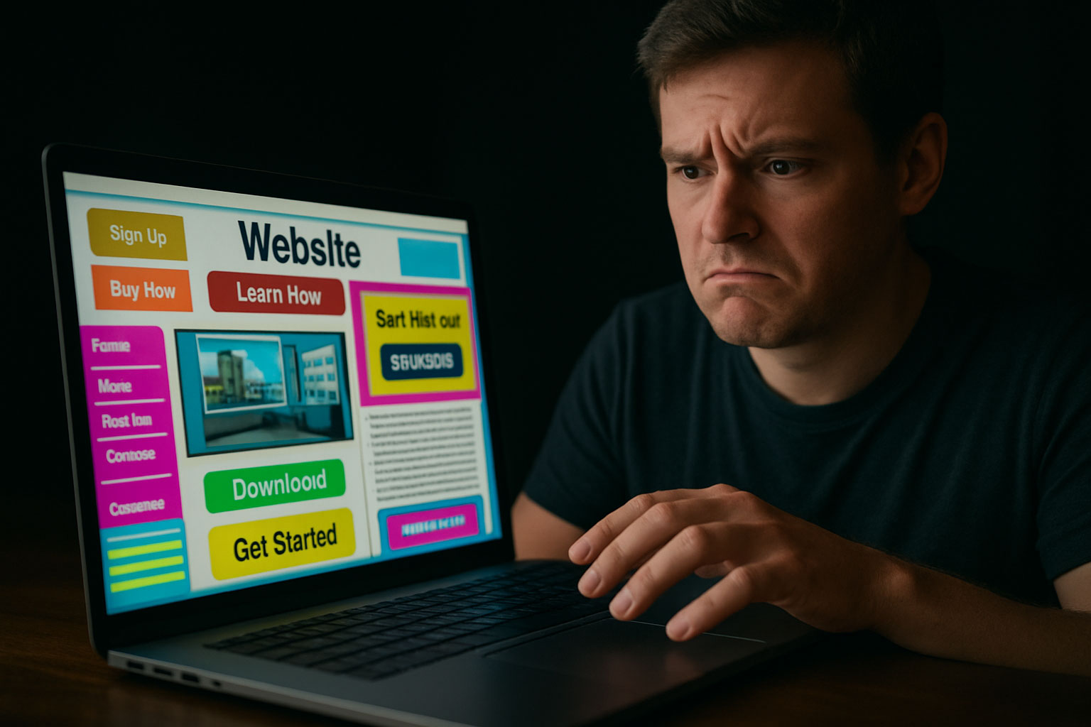
The Cost? Qualified leads who would have bought… if they could just figure out what you’re selling.
Finally…
Here’s what this all adds up to: You’re paying for a website that’s working against you.
Every day your site has these issues is another day you’re losing customers to competitors who simply have better websites. Not better products. Not better service. Just better websites.
The good news? These problems are fixable.
At Pishon Design Studio, we build websites really well. These websites are fast, modern, mobile-optimized sites with clear messaging and CTAs that convert visitors into customers. After all, you just read this entire blog post.
Let’s talk about building you something that actually sells.
Stop Losing Money to a Bad Website
Get a fast, modern, mobile-optimized website that actually converts visitors into customers.
No setup fees. Built for results.


