Web design is changing constantly – with the advent of mobile media and what I call the ipad nightmare. For web designers, the need to step up is almost going to be overwhelming. Hopefully, this post will give you a little idea about what you need to step up to as a web designer in middle-earth!

HTML5:
 The current version of the HTML markup language was still in development in June 2011, but it is already being used as an all-encompassing update to HTML4, XHTML1, and JavaScript. It’s an effort to standardize markup language to avoid syntax errors in web documents. HTML5 also defines how invalid documents should be processed. This ensures that all browsers will treat syntactical errors the same way. If language in the real world was updated as often as HTML, maybe we would finally all just get along. As it is, we might as well sit in front of our computer monitors and rely on this standardized markup language to understand each other, even if we never end up leaving the house again.
CSS3:
Not all browsers have adopted CSS3 as a whole yet, but they are slowly starting to come around. Using CSS3 is like scrapbooking vs. shoving your photos into those self-stick photo albums with plastic page protectors. Some of the new features of CSS3 include rounded corners, mega drop-down menus, animated buttons, multiple backgrounds, and a hell of a lot more. Web applications just got a lot cooler—don’t let anyone keep calling you a geek.
Single Page Websites with Sliders:
The sliders that became popular in 2010 were bite-sized and held a hunk of meat between two pieces of bun. Sliders are now the trend when it comes to fitting a lot of information on one in-your-face web page. Instead of incorporating a slideshow into your website, your website becomes the slide show. Visitors to your website no longer have to drag the mouse over complicated nav bars or menus. Instead, you can capture their interest with breathtaking design elements. Oh, not interested in that one? Click on the arrow, and—voila—but wait, there’s more! Sliders let you use visuals to entice your audience. Not everyone can read, you know.
Mobile Design:
 With the increasing popularity of tablet technology and smartphones, web designers must adapt to new standards. Screen resolutions are different, and they can’t accommodate the same extravagances as computers. Instead of having to create a separate, lackluster site, CSS3 allows web designers to accommodate mobile technology into the website design. Icons should still be striking and colorful; text should be readable. A mobile website should retain the design elements of the original, just in a smaller, touch-screen-friendly format. Today, more people will be buying smartphones than personal computers. That means that websites should look just as good—if not better—on a tiny screen as on a high-definition 17-inch monitor.
Impressive Typography:
 It’s no longer a simple war between Arial and Times New Roman. In fact, Calibri is the default font on Microsoft Word 2010. With more browsers supporting font-replacement methods, web designers can integrate custom fonts into websites. Mixing bold and scrolling letters and using extra-large font sizes to grab viewers’ attention is becoming mainstream. Think bold, fun, and unique. When everyone and her mother has a website, think about how to make yours different.
Big Images & Photo Backgrounds Textures:
 Now, images are actually being used as the backgrounds themselves. With digital SLR cameras that can take super high-quality photos, it’s easier to get huge pictures with amazing quality to take up the screen. These backgrounds can be quirky or hyper-realistic, but they draw you into the scene. You want to check out that website simply because you can’t take your eyes off the page. But make sure your image is great quality and that it doesn’t compete with your content. It still has to look like a background, even if it is larger than life. It’s all about harmony.
Design Below the Fold:
It used to be a faux pas to make a user scroll down to get to anything slightly resembling important information. Click the down arrow? The horror! Since so many users don’t have to click anything anymore—in fact, they revel in putting their grimy fingers all over their screens, whether they’re using a laptop, tablet, or smartphone—feel free to put your content anywhere. Do you want to put your main message at the very bottom of the page? Probably not. But that’s common sense, no matter what your aspect ratio is. Chapter one is always at the beginning of the book. Likewise, keep your important information on top, but don’t design your website to fit a particular size.
WordPress:
Tutorials for transferring a domain to WordPress are all over the place. That’s because WordPress allows you to set up your website and alter its features without really even having to know how to do it. It’s user-friendly and relatively self-explanatory.
You can change the look of your website by changing the template or add a feature with a plugin. So many people are using it that if you encounter any difficulty, you can easily troubleshoot it by doing a quick internet search. WordPress is the wave of the future, and it’s a trend that’s also keeping up with the trends. It’s evolving just as quickly as everything else in the internet world, if not faster.
Social Media Sharing:
 Sharing Web development is no longer about working in a vacuum. In fact, your website may not survive if it’s not followed, liked, and tweeted about. The internet is becoming a big party. If you don’t have a blog, maybe you’re not necessarily living in the dark ages, but you’re living on Sesame Street. If your blog is not on your website’s home page, you might not be considered one of the cool kids. This is the age of connection, so your website should be integrated with social media sites. The internet is turning into a
worldwide game of Six Degrees of Kevin Bacon.
If you’re not making yourself known on social networking sites, you’re going to be that one lone wallflower in the corner who has fewer than 100 Facebook friends. Make sure the design elements of your web page allow viewers to easily connect with you. Make sure your marketing strategy involves networking. Few people are going to find your website on their own. Network now!
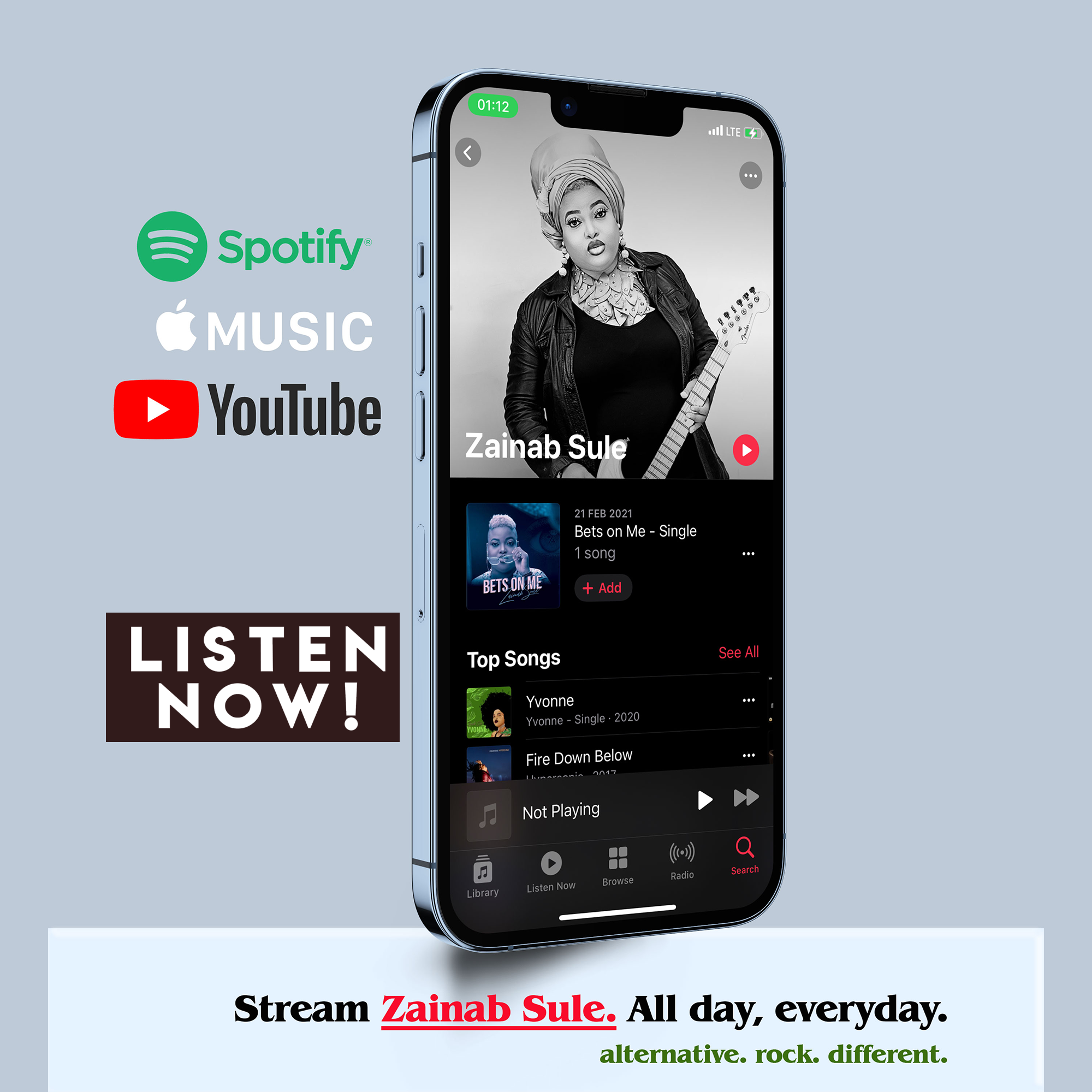
Speaking of social networking, follow me on twitter with @zainabSULE
Have fun.
Zainab