Designing a website to showcase photography is not as simple as it sounds. It needs planning, intense concentration and a whole lot of patience. With a normal website, there is usually a consistent structure, which includes a header, a navigation menu, sometimes a sidebar, and usually a footer. However, when showcasing photography, there are no limits. You don’t need a navigation bar, header, or footer, if you don’t want to have them.
Here’s my 2 cents on what you need to design a great photography based website.
High Resolution LARGE & Original Images
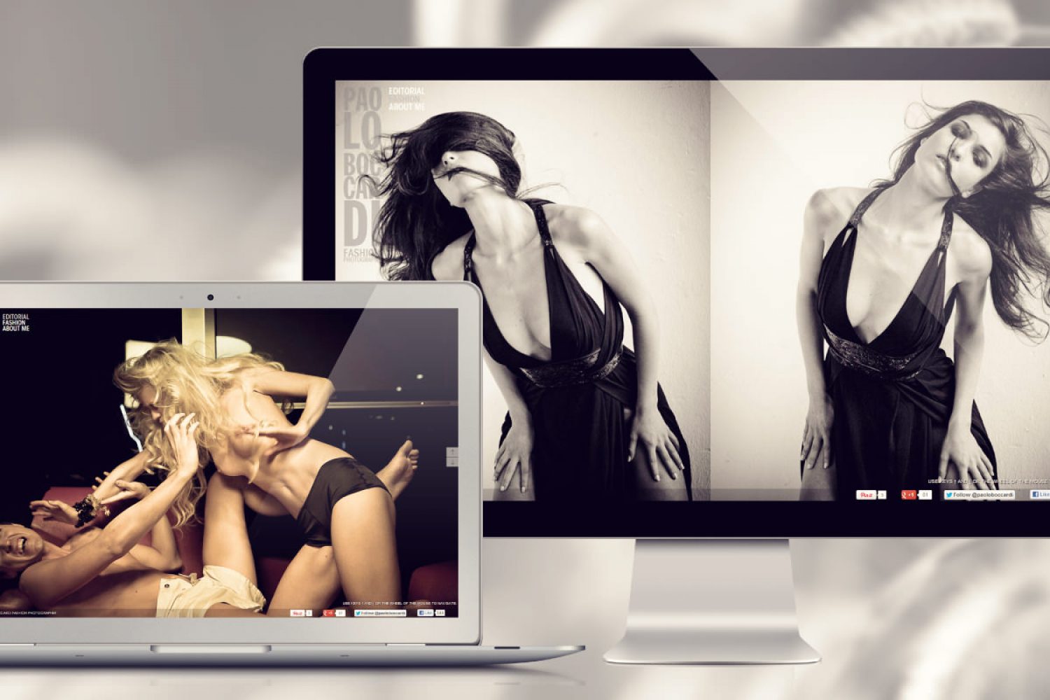
That’s a no-brainer. You need a selection of your client’s best images. Make it large. Make it original. But don’t make it too much. No one wants to sit for hours watching a website with over 1mb of pictures load. Yet every one knows that one of the most visually stunning ways to use photography is when it is large. Images should represent what your client’s site or brand is all about without a lot of additional detail.
Don’t display “full size” images at 300px by 300px.
Photography websites are meant to be seen at the highest quality and not optimized for bandwidth. When you consider your target demographic, chances are high that they are located near you.
Provide high-resolution images for your clients and in return they may have to wait a couple seconds longer. Everything on the Internet comes with a price; it just so happens that the price for high-quality work is longer load times.
Always Sketch.
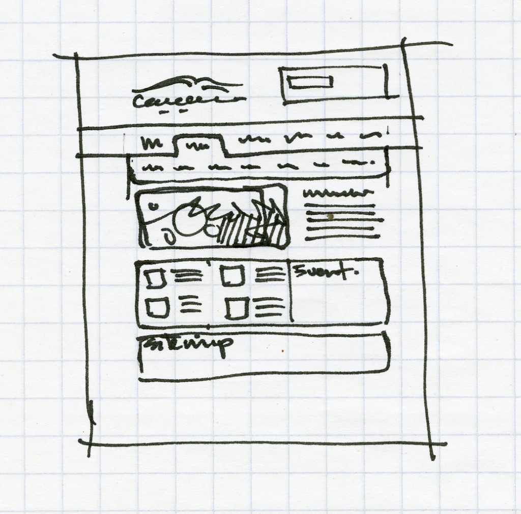
Sketching out a layout before you even touch the mouse is a common practice amongst web designers.
Every designer worth his salt must have long incorporated the art of sketching websites on paper before the actual version goes online. If you sketch out your idea while it’s fresh in your mind, you won’t lose track of it or have any other ideas write over it.
It’s an easy way of sticking to your original plan. You don’t have to be exact, but try to stick to the sketch as much as possible, when possible.
Sketches, mockups, whatever. Just do it before you start the work.
Use Grids.
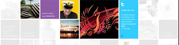
A beautiful grouping of photos can add drama to your site. Select images that you can see at smaller sizes. Typically this will include images with simpler framing and composition. This design technique is popular with looking at groups of tight images or faces. It does not work so well for landscapes or images with a lot of detailing.
Final points worthy of note:
– Stay Away from Too Many Effects
– Mix Up Shape and Size
– Be strategic when placing text
– Use a Large Viewing Area
In conclusion,
Always consider the end user. Make it as easy as possible for your users to view your client’s portfolio. Complex navigation and layouts are of no use if they cannot move around your website without getting lost.
Cheers.
Zee
All images from google. 🙂